
The choice of colors to use in a painting are endless. In addition to composition, subject matter and size, the artist has to choose what colors will best convey the mood that he/she is trying to express to the viewer.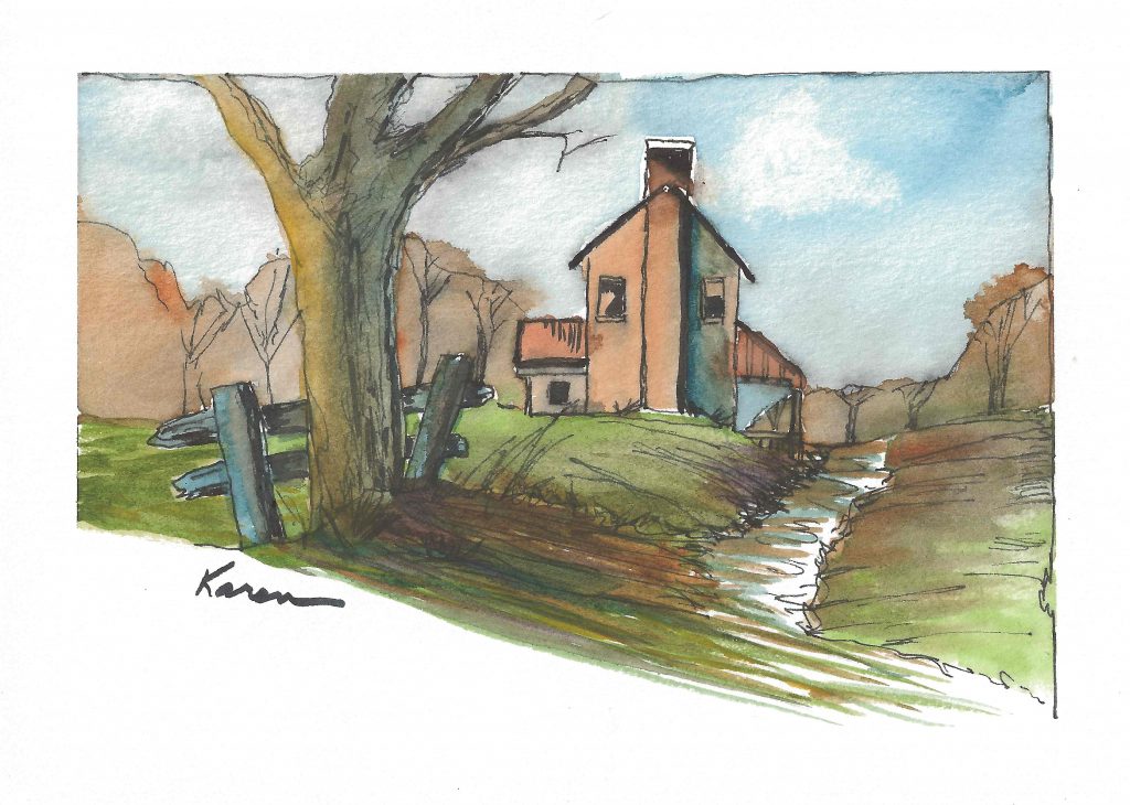
The color palette that I used in the painting above was earth tones, mostly muted, with nothing very bright, and nothing very dark. The result (I hope) is one of a peaceful farm scene.
A contrasting option would be in the painting below.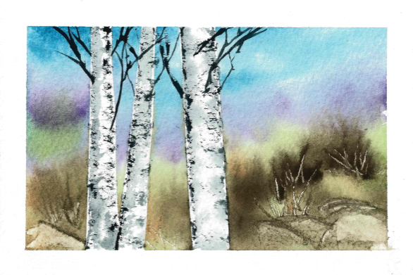
Much brighter colors (mostly whites) tell a different story in this painting.
Two different moods – two different paintings. The next time you look at paintings in a museum or in an art gallery, think about the color palette used and the story that the artist was trying to tell with those colors.
Love your work, Karen.
Thank you Cindy!
Considering I am colorblind, and speak for our “kind,” I understand that with any “handicap,” there are some experiences that simply cannot be shared by myself and the general populace. With that said, however, do you feel that use of shading within the grayscale alone can accomplish the same mood effects?